Deciding on a Floor Plan
Update: We remodeled our skoolie after several months to accommodate our needs better. To see the updated floor plan, check out this post!
Even the best-laid plans go awry. At one point or another, we have all thrown out the playbook and started over in order to make something work. And that is, essentially, the story of our skoolie’s floor plan.
Eventually, however, we realize that it is easier to adapt and flow than it is to quit and restart each time something doesn’t go right. I think Bruce Lee said it best when he said, “Empty your mind. Be formless, shapeless. Be like water. If you put water into a cup, it becomes the cup. Put water into a bottle, it becomes the bottle. If you put water into a teacup, it becomes the teacup. Water can flow, or it can crash. Be water, my friend.”
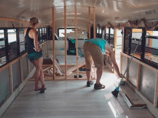 We started planning our bus layout long before we ever pulled him into the driveway. Our plans had already gone sideways looking for and finding the right bus, but we had no idea that what we thought was a concrete layout would get changed over a hundred times in so many little ways as we went along.
THE FLOOR PLAN REQUIREMENTS
We had a few simple “must haves” when designing our floor plan.
- An open layout. We were working with a little under 300 square feet, so we didn’t want to break it up into even smaller sections with too many walls and dividers. Maintaining an open floor plan was top of the list.
- No middle aisle. We saw this design over and over and knew we wanted something different in order to make it feel more like a home and less like, well, a bus.
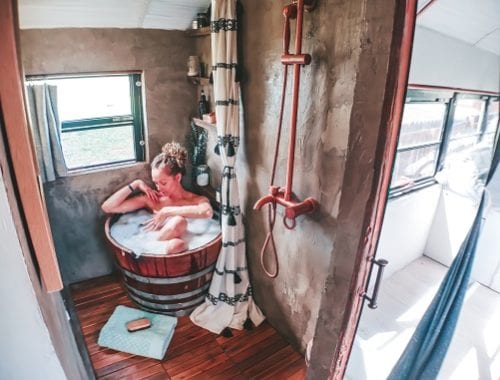
- A big ass bathroom. By skoolie standards anyway. We didn’t want a split bathroom on different sides of the bus, and we didn’t want a tiny stall of a shower.
- Separation from the kiddos. Many designs throw all the beds in the back, but we enjoy mommy/daddy time and didn’t want to spend every night worrying that our extracurricular activities were taking place mere feet away from our teenagers, possibly being overheard and traumatizing us all.
PLAN ONE
Our first plan was laid out in chalk on the concrete floor of our gym in choppy measurements. We’d drawn to scale models on graph paper and done a model in a 3D computer program and were convinced it was perfect.
We had plenty of inspiration – the L-shaped kitchen of The Mayes Team and the minimalist feel of Trebventure among them.
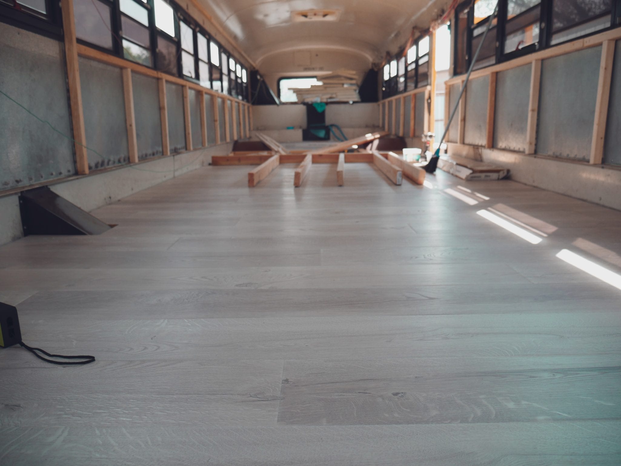
Real life, however, had us making the first changes. The plans we’d used to base measurements on didn’t match the bus we ended up with. The emergency side door was in a different place altogether, and the interior of the bus was much different in real life than drawn flat on the floor.
Change one of a hundred down.
PLANS TWO THROUGH, LIKE, SEVENTY
Once we actually had THE bus, we started planning in real-time.
We wanted the bus to maintain an open feel, so we had to be careful about where we put walls up. Along the same lines, we had to consider furniture and fixtures like the fridge and the kids’ bunk bed, because they were tall and could make the bus feel closed and cramped if placed wrong.
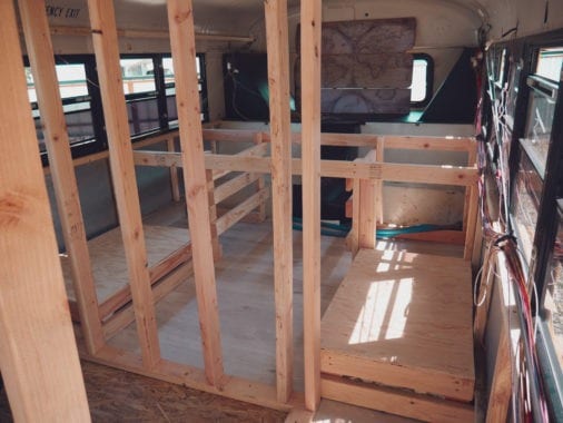
We also didn’t like the center aisle feel, with everything lined up at the sides all the way down the bus until the master bedroom at the end. It isn’t bad, and it keeps things open, but it does maintain the school bus feel a little more.
Don’t get me wrong, that approach is intelligent. A bus’s highest ceiling height is in the middle, so that’s where one would want to walk. Luckily, we aren’t especially tall, so we didn’t really care.
Now at this point, we’d already changed pretty much everything about our original design. The kitchen and bathroom had to swap sides, the kids’ beds had to shrink, our plumbing had to be rearranged, and the wood stove moved about 20 times.
THE FLOOR PLAN WE ACTUALLY WENT WITH
You can see the whole plan layout here.
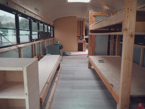
We put the kids’ bunk right behind the driver’s seat. Since the fridge was the same height, it backed right up to it, separated from the rest of the kitchen.
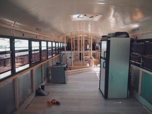
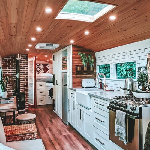
Across from the bunk bed are the couch and the other half of the kitchen (an “L” shape counter with a breakfast bar).
On the same side of the counters is the bathroom, the only room with completely framed-in walls on the entire bus. The bathroom is a surprisingly decent size, fully accommodating a shower, sink, and toilet, as well as our washer/dryer unit.
The bathroom wall on the outside leaves a hall that leads to the master bedroom.
There, we have a large space that includes a closet, a platform bed (under which is a massive storage space), and a reading nook right next to the big back window, courtesy of the engine on which it sits.
Considering this space houses four people and a Great Dane, we’re pretty impressed with how open and homey it continues to feel.
The point of the bus is not to have a big space to live, obviously. The point of the bus is to facilitate freedom and travel, and for that, we would accept much worse living conditions.
Fortunately, we didn’t have to settle. With careful planning and a lot of determination, we were able to build our bus exactly the way we wanted it, without needing to compromise.
 It took months of planning and frustration and even days when we didn’t know how it was all going to be possible. The months prior to moving into the bus were some of the hardest we’d ever faced together.
But we didn’t give up, and neither should you. We create our own reality. If you want something bad enough, you can make it happen.
What problems did you face with your own skoolie floor plan? Have questions about ours? As always, you can reach us at info@sincewewokeup.com!

